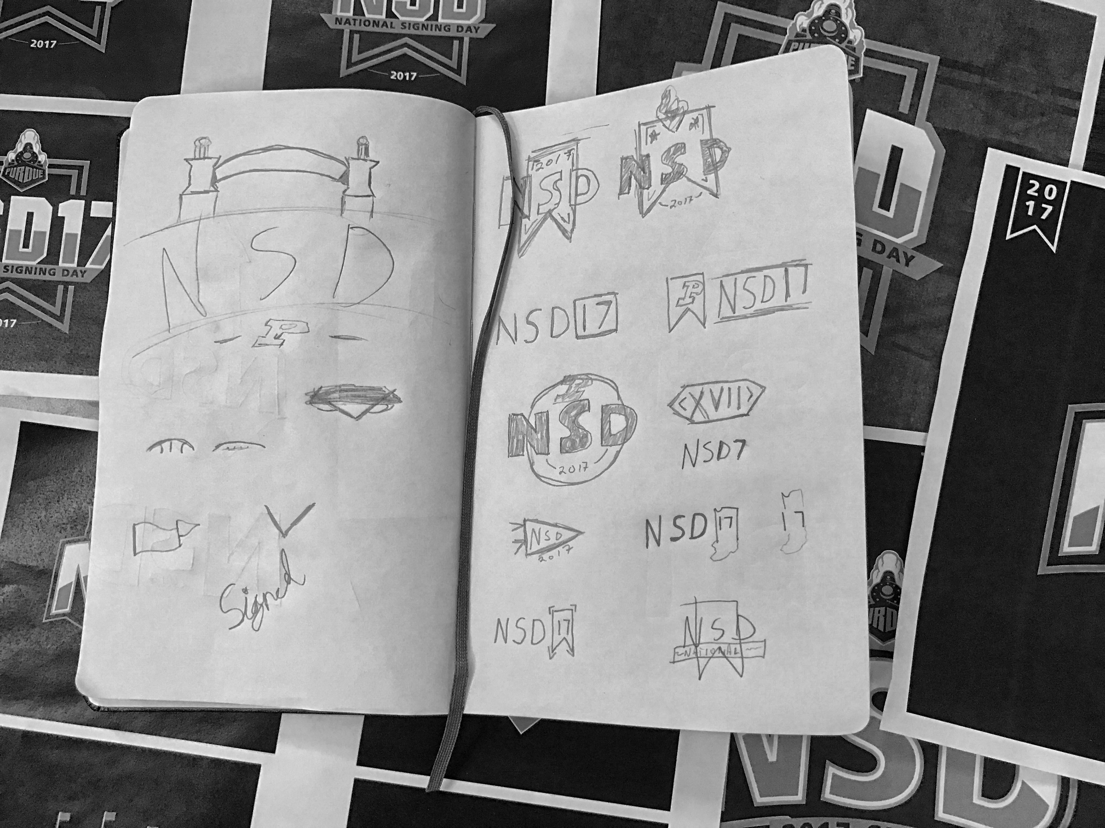
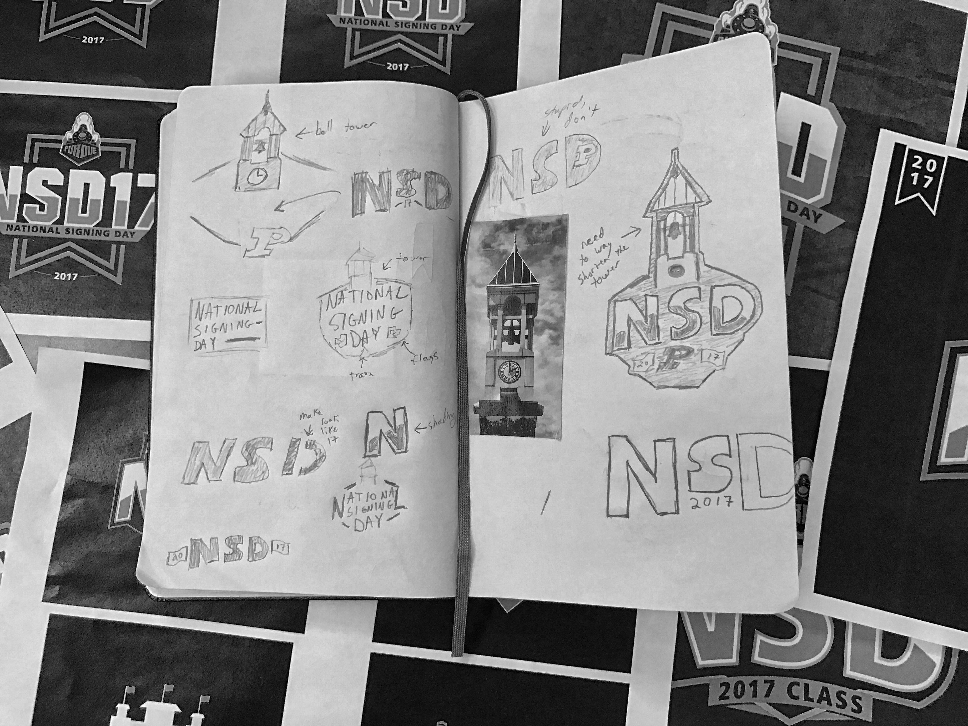
Like any good logo creation process, it began with a lot of sketching and research. Below are some of my sketches exploring various Purdue landmarks with the possibility of incorporating it into the logo.
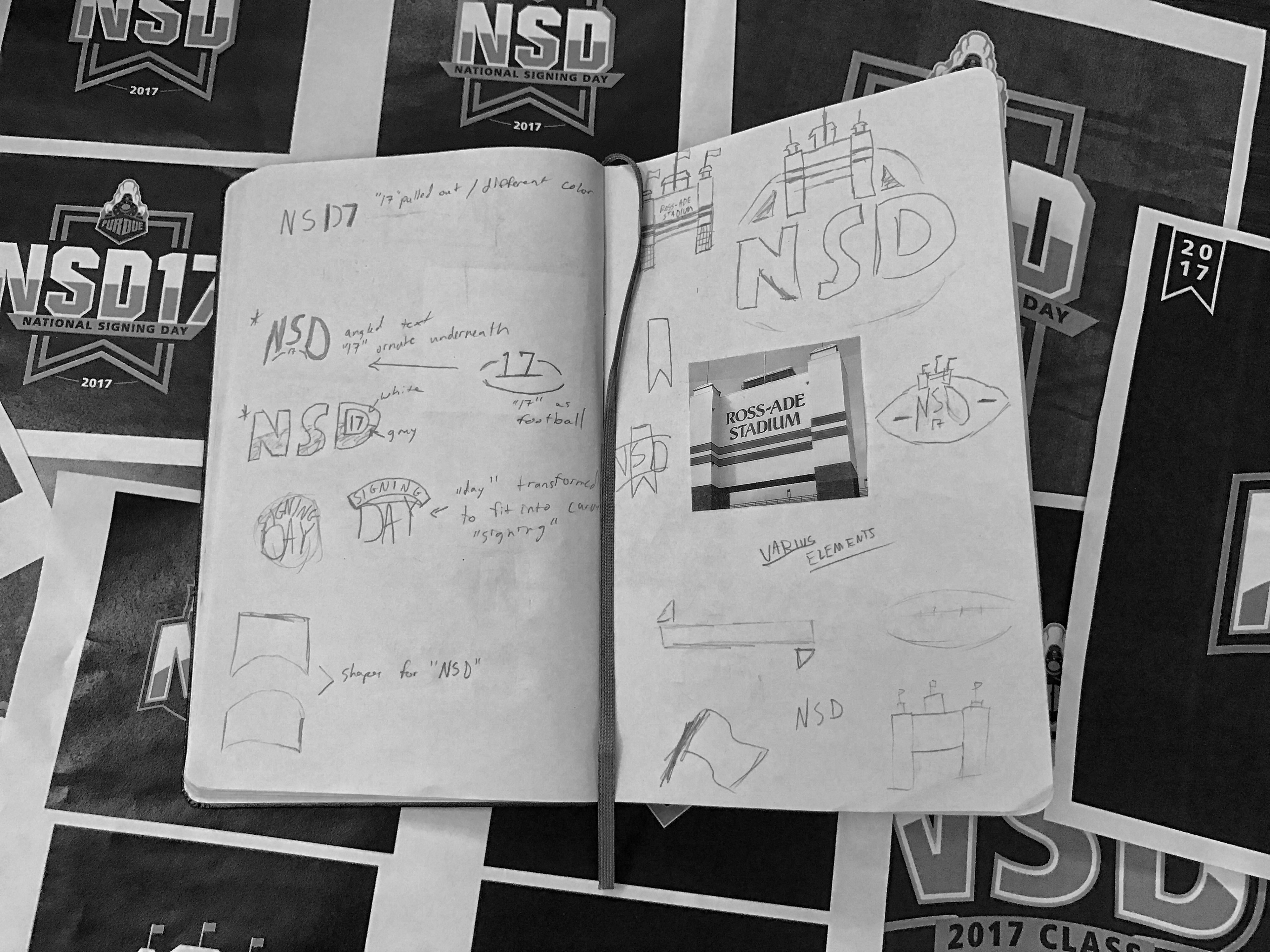
I ultimately went with the Gateway to the Future Arch and began digitizing my ideas.
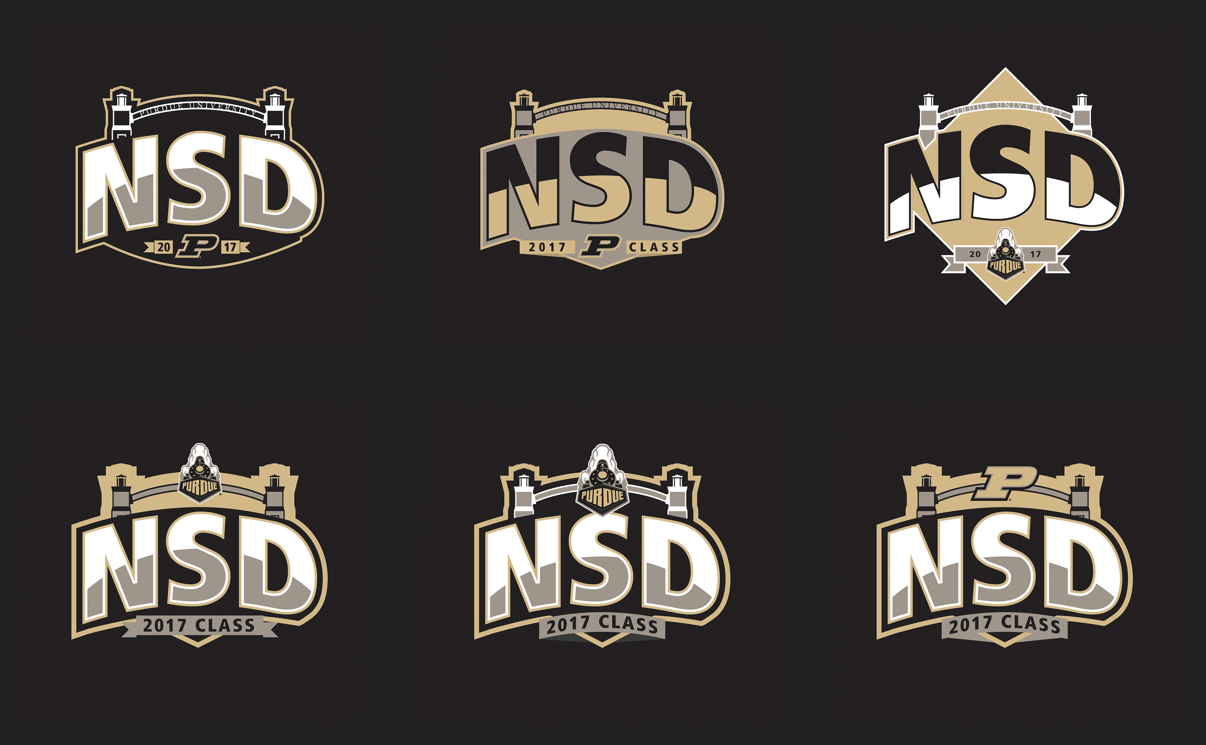
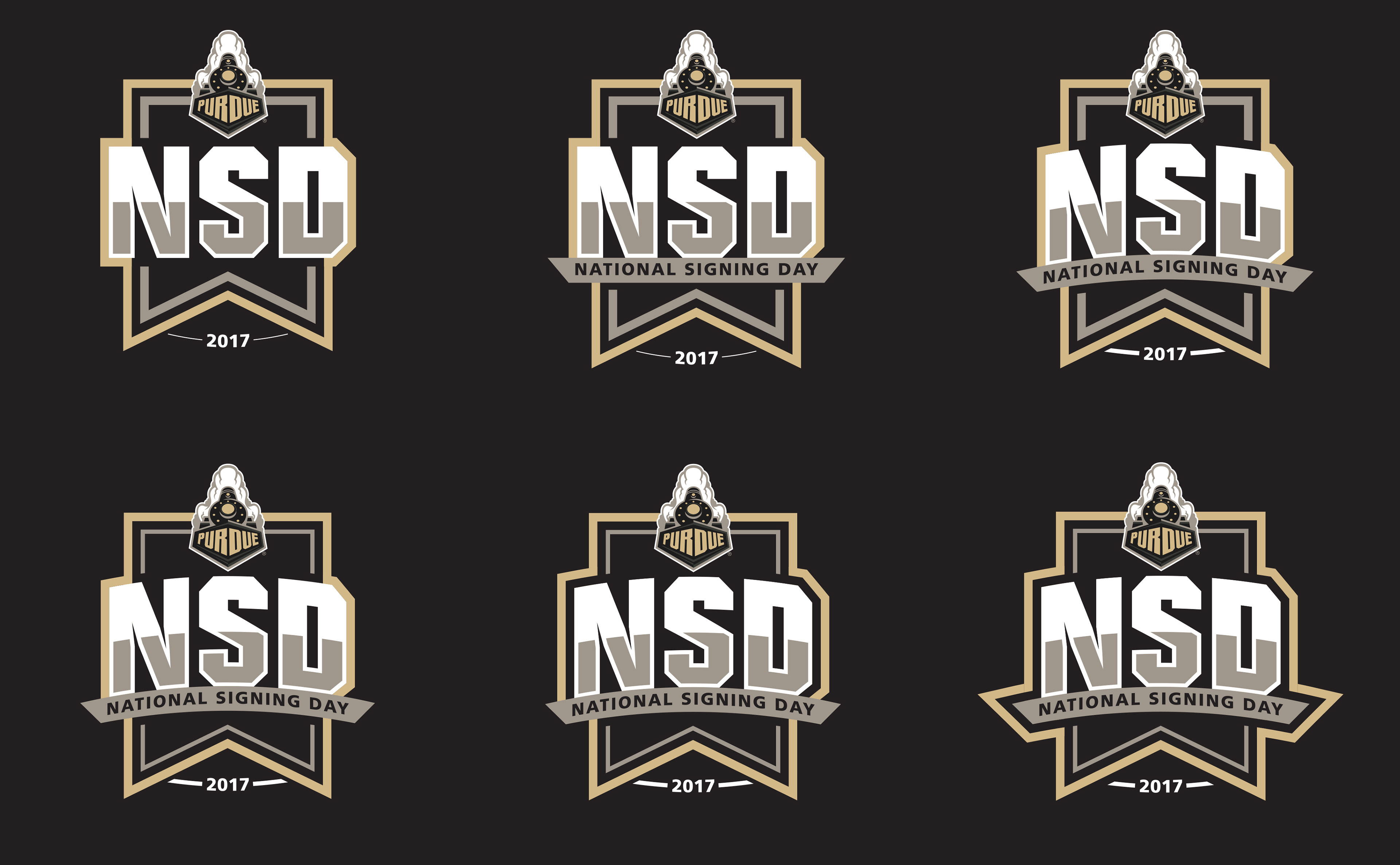
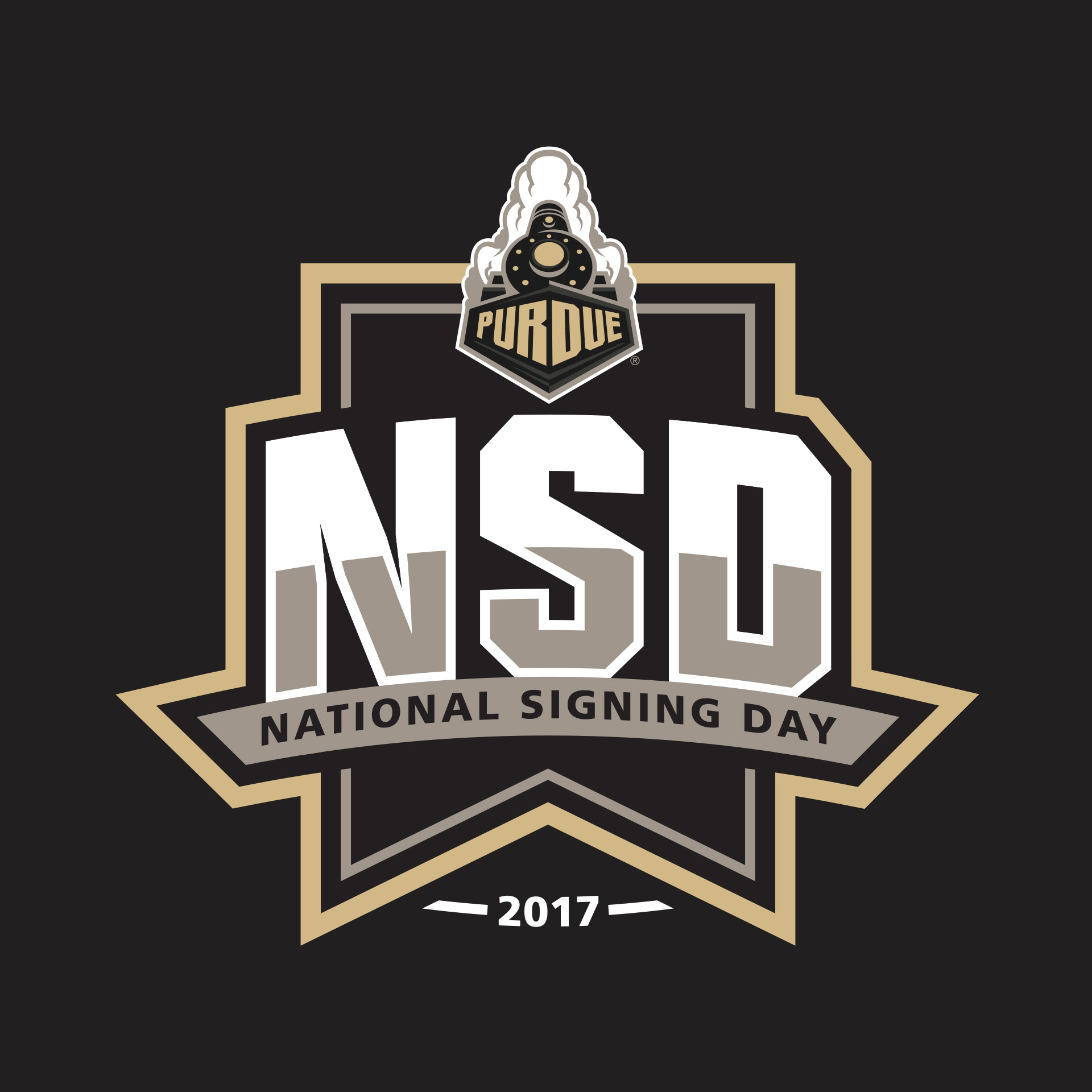
I discovered that I was overthinking it and not conveying what I wanted. The logos were looking busy, not symmetric & lacking structure. So I did what I always do when I get too focused on one idea that is not working, I scrapped everything and restarted from scratch. This time, I kept reminding myself to simplify and think of a logo that would be strong & bold.